Build an iOS app with SwiftUI
The source code for this guide can be found on GitHub
In this tutorial you’re going to use Swift and SwiftUI to build a small app to recommend fun new activities to users. Along the way you’ll meet several of the basic components of a SwiftUI app, including text, images, buttons, shapes, stacks, and program state.
To get started, you’ll need to download Xcode from the Mac App Store. It’s free, and comes with Swift and all the other tools you need to follow this tutorial.
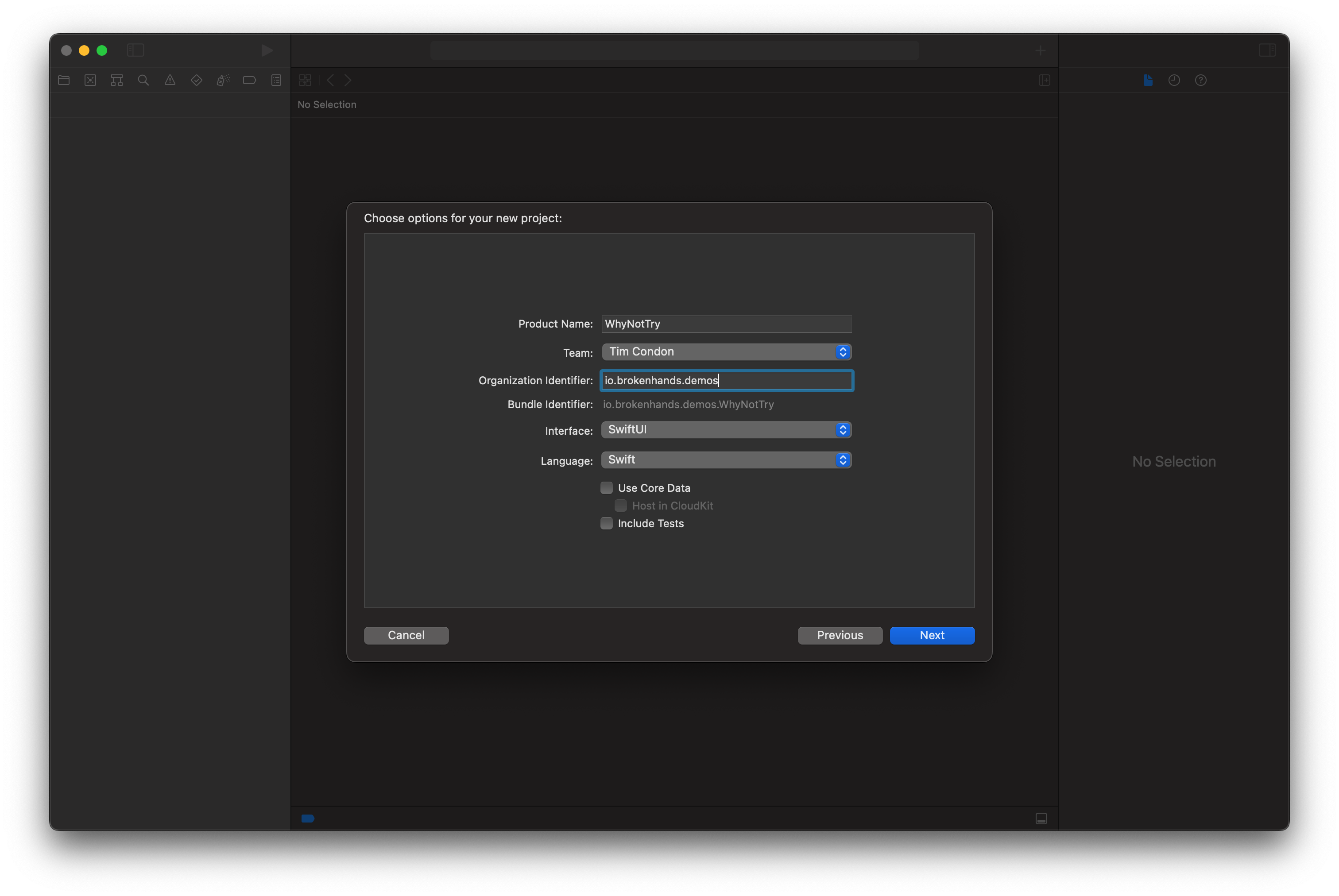
Go ahead and launch Xcode once it’s installed, then select Create a new Xcode Project. Select the iOS tab at the top, then select the App template and press Next.
Tip: Although we’ll be targeting iOS 16, our code will also work great on macOS Ventura and beyond.
When making a new project, Xcode will ask you for a few pieces of information:
- For Product Name, enter “WhyNotTry”.
- For Organization Identifier you can enter com.example. In real apps we’d normally enter our own domain name here, e.g. org.swift.
- For Interface make sure SwiftUI is selected.
- You can uncheck the boxes for Core Data and Include Tests; we won’t be using them here.
When you press Next, Xcode will ask where you want to save the project. You’re welcome to choose wherever suits you, but you might find your Desktop is easiest. Once that’s done, Xcode will create the new project for you, then open ContentView.swift for editing. This is where we’ll write all our code, and you’ll see some default SwiftUI code in there for us.
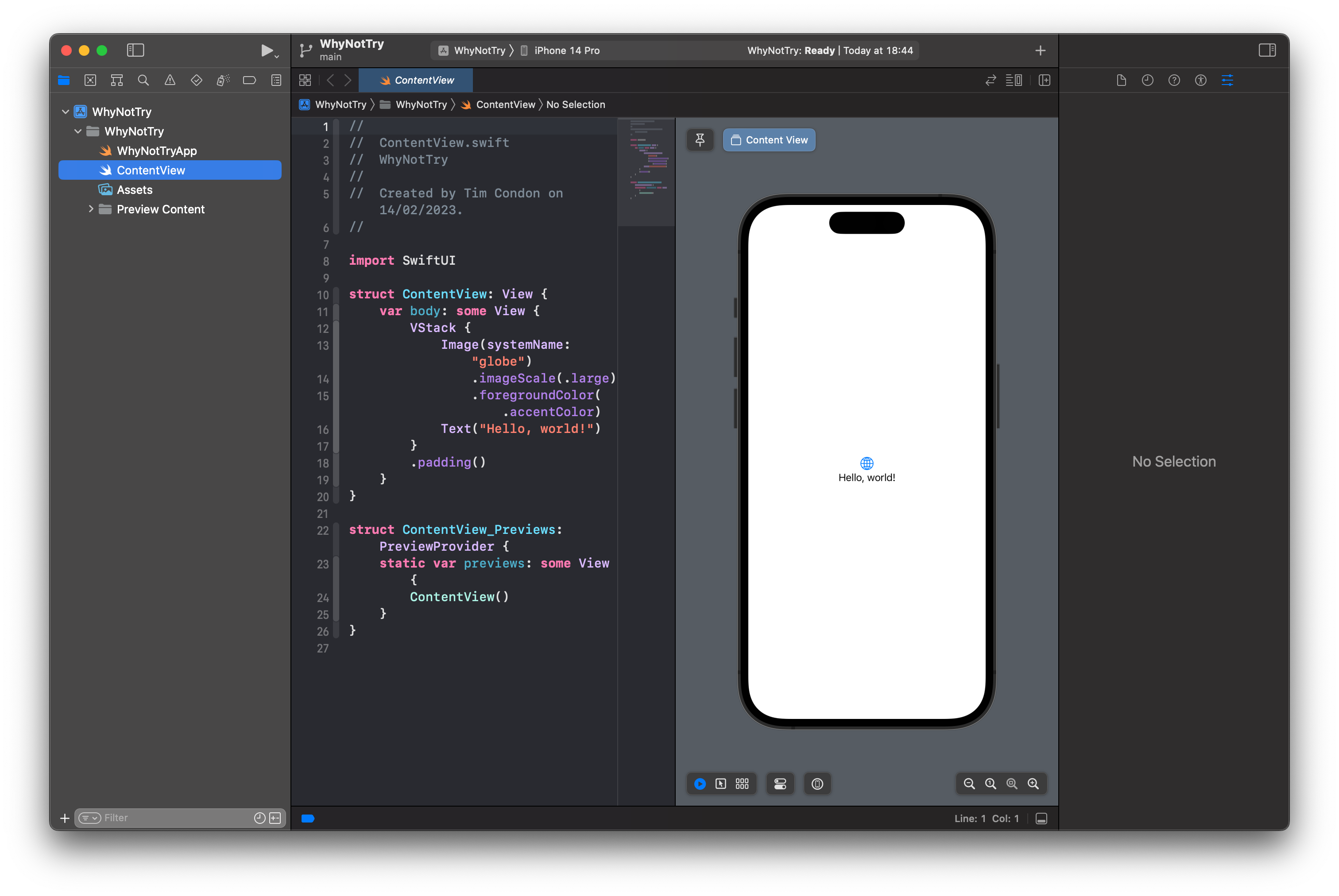
The example code Xcode made for us creates a new view called ContentView. Views are how SwiftUI represents our app’s user interface on the screen, and we can add custom layout and logic in there.
On the right-hand side of Xcode, you’ll see a live preview of that code running – if you make a change to the code on the left, it will appear in the preview straight away. If you can’t see the preview, follow these instructions to enable it.
For example, try replacing the default body code with this:
var body: some View {
    Text("Hello, SwiftUI!")
}
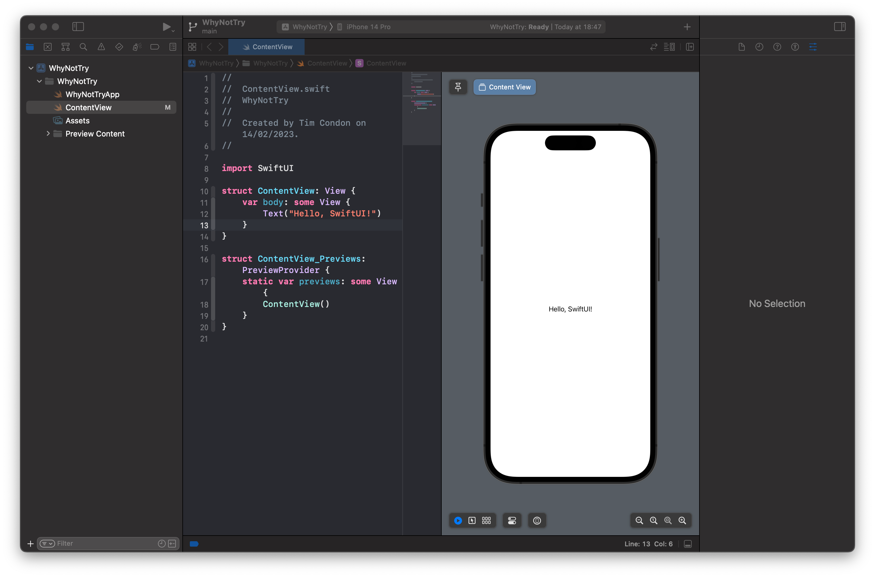
You should see your preview update immediately, which makes for really fast prototyping while you work. This is a computed property called body, and SwiftUI will call that whenever it wants to display our user interface.
Building a static UI
In this app we’re going to show the user a new activity they could try to keep fit, such as basketball, golf, and hiking. To make it a little more attractive, we’ll display each activity using its name, and also an icon representing the activity, then add a splash of color behind it.
The main part of our user interface will be a circle showing the currently recommended activity. We can draw circles just by writing Circle, so replace the Text("Hello, SwiftUI!") view with this:
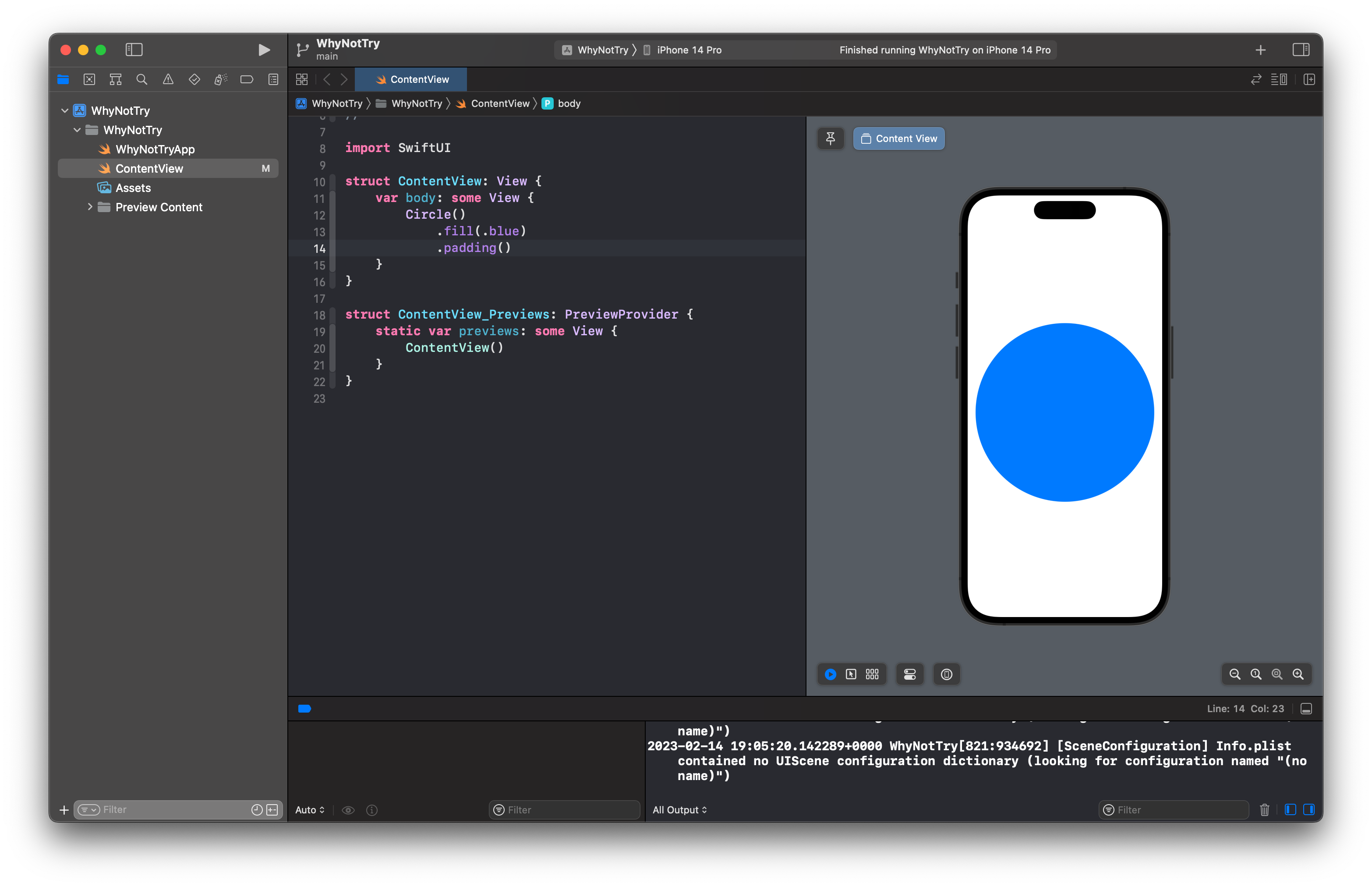
Circle()
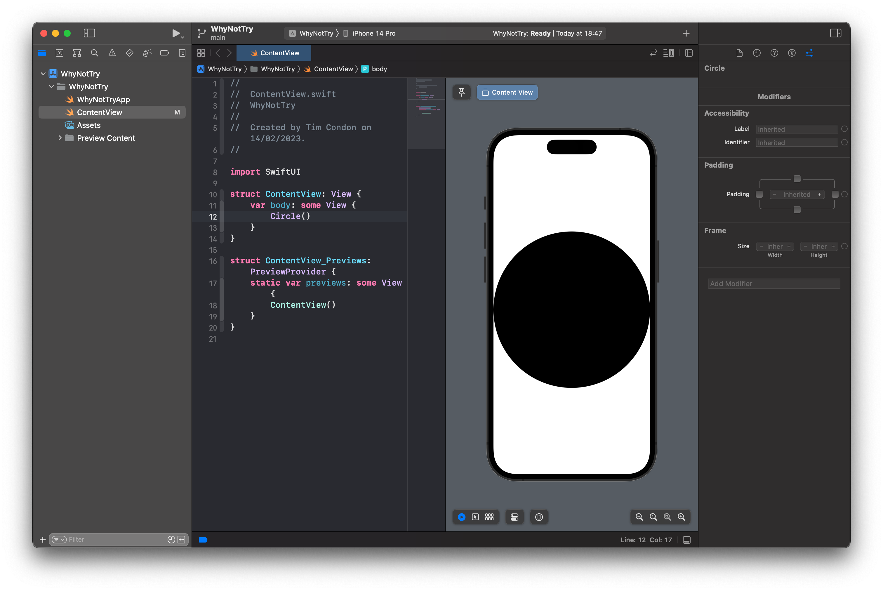
In your preview you’ll see a large black circle fills the available screen width. That’s a start, but it’s not quite right – we want some color in there, and ideally adding a little space on either side so it doesn’t look so tight.
Both of these can be accomplished by calling methods on the Circle view. We call these view modifiers in SwiftUI because they modify the way the circle looks or works, and in this case we need to use the fill() modifier to color the circle, then the padding() modifier to add some space around it, like this:
Circle()
    .fill(.blue)
    .padding()
The .blue color is one of several built-in options, such as .red, .white, and .green. These are all appearance aware, which means they look subtly different depending on the whether the device is in dark mode or light mode.
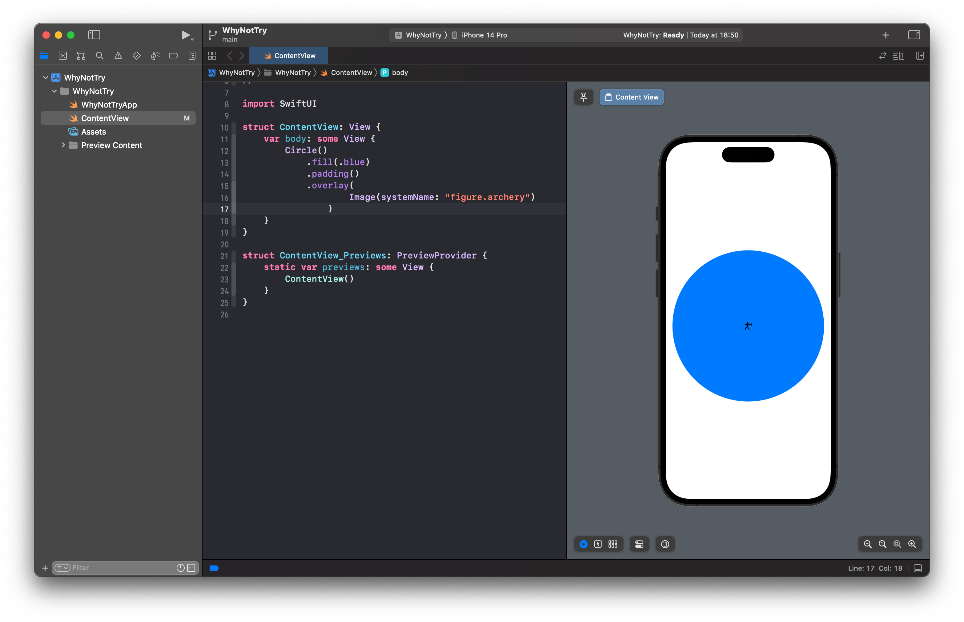
Over that blue circle we’re going to place an icon showing the activity we recommend. iOS comes with several thousand free icons called SF Symbols, and there’s a free app you can download that shows you all the options. Each of these icons is available in multiple weights, can be scaled up or down smoothly, and many can also be colored.
Here, though, we want something nice and simple: we want just one icon placed over our circle. This means using another modifier called overlay(), which places one view over another. Modify your code to this:
Circle()
    .fill(.blue)
    .padding()
    .overlay(
        Image(systemName: "figure.archery")
    )
You should see a small, black archery icon over our large, blue circle – it’s the right idea, but it doesn’t look great.
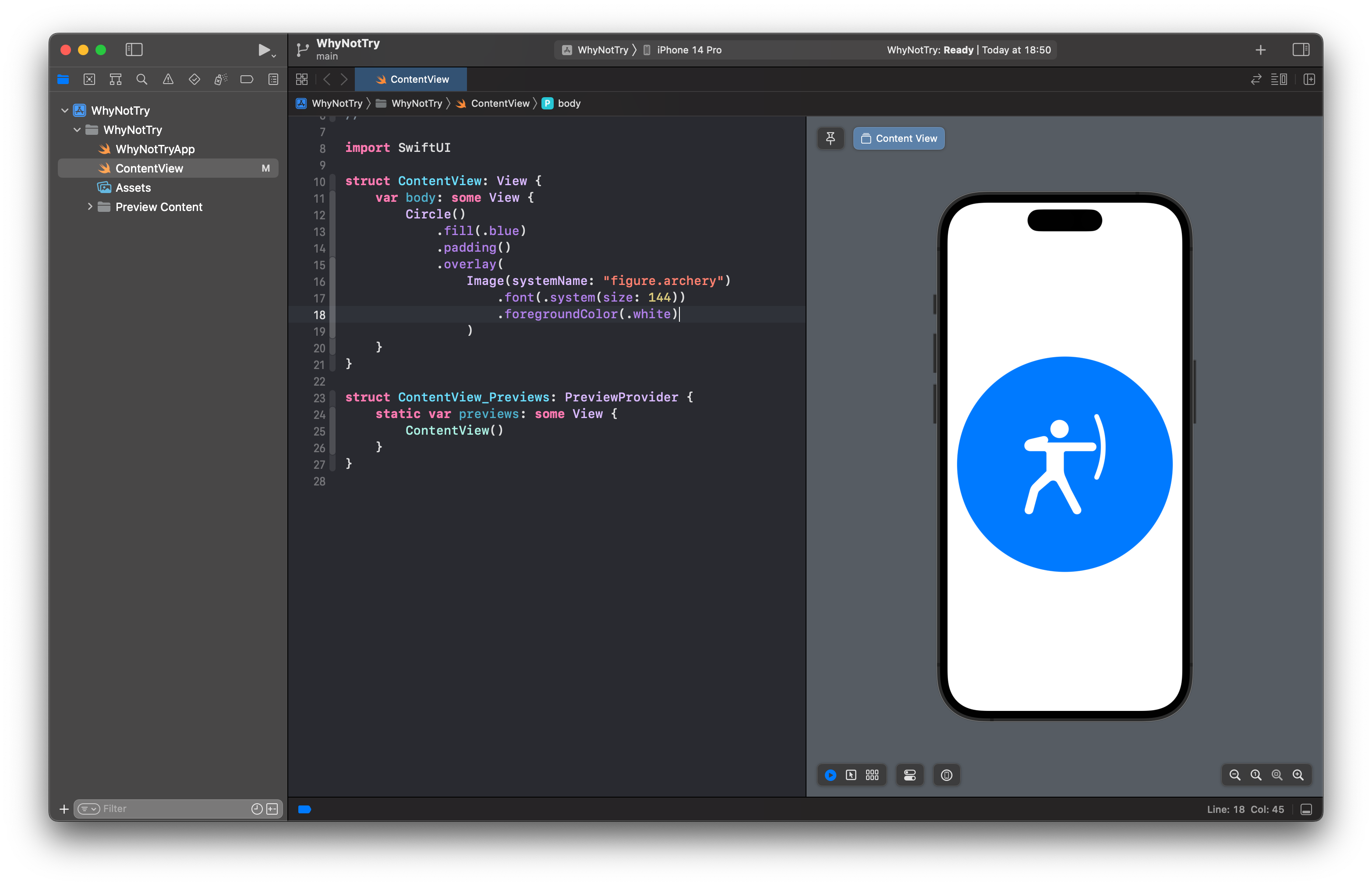
What we really want is the archery icon to be much bigger, and also much more visible on that background. For that we need another two modifiers: font() to control the size of the icon, and foregroundColor() to change its color. Yes, we use a font modifier to control the icon’s size – SF Symbols like this one automatically scale with the rest of our text, which makes them really flexible.
Adjust your Image code to this:
Image(systemName: "figure.archery")
    .font(.system(size: 144))
    .foregroundColor(.white)
Tip: That font() modifier asks for a 144-point system font, which is nice and big on all devices.
That should now look a lot better.
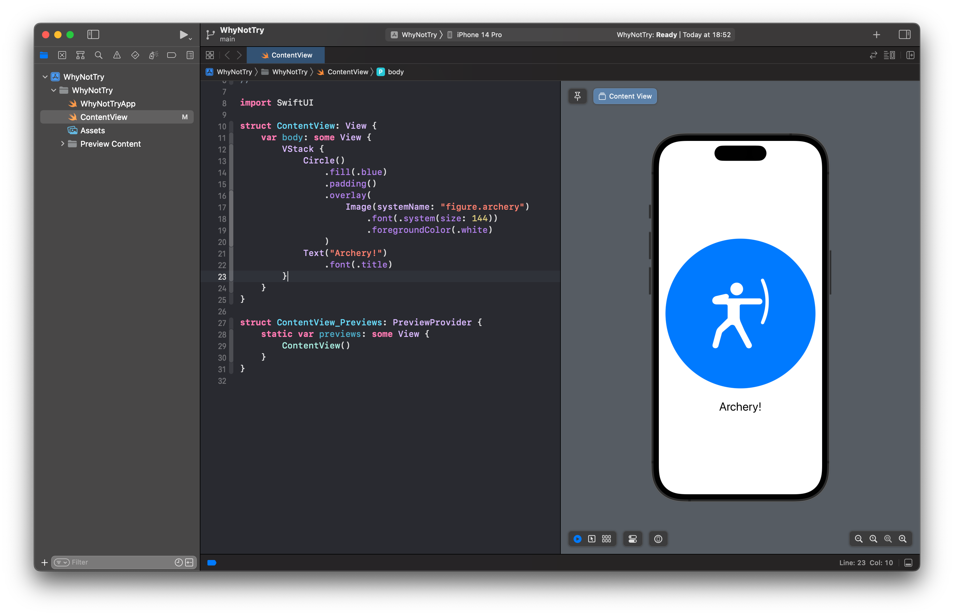
Next, let’s add some text below the image so it’s clear to the user what the suggestion is. You already met the Text view and the font() modifier, so you can add this code below the Circle code:
Text("Archery!")
    .font(.title)
Rather than using a fixed font size, that uses one of SwiftUI’s built in Dynamic Type sizes called .title. This means the font will grow or shrink depending on the user’s settings, which is usually a good idea.
If everything has gone to plan, your code should look like this:
var body: some View {
    Circle()
        .fill(.blue)
        .padding()
        .overlay(
            Image(systemName: "figure.archery")
                .font(.system(size: 144))
                .foregroundColor(.white)
        )

    Text("Archery!")
        .font(.title)
}
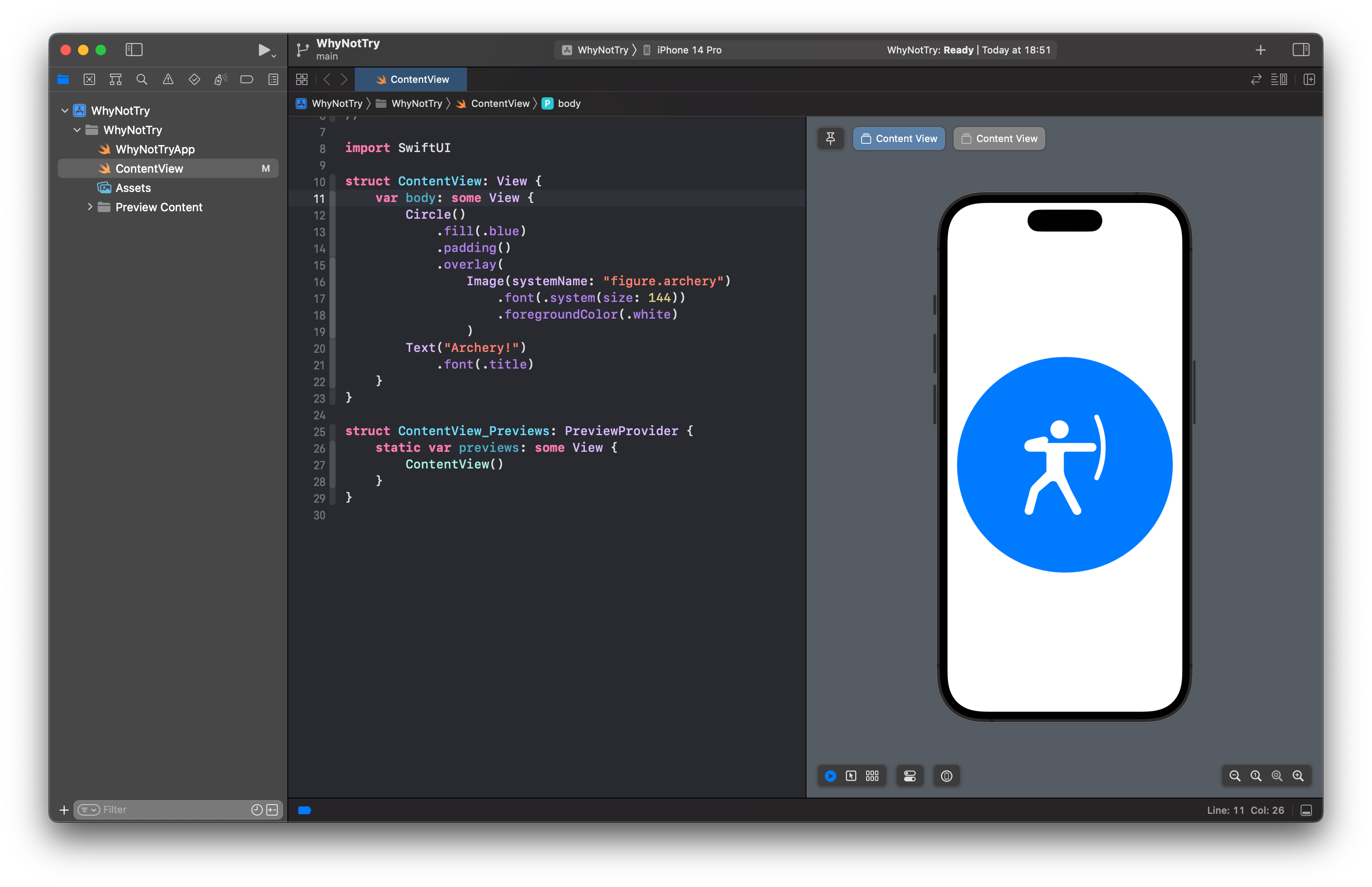
However, what you see in Xcode’s preview probably won’t match what you were expecting: you’ll see the same icon as before, but no text. What gives?
The problem here is that we’ve told SwiftUI our user interface will have two views inside – the circle and some text – but we haven’t told it how to arrange them. Do we want them side by side? One above the other? Or in some other kind of layout?
We get to choose, but I think here a vertical layout will look better. In SwiftUI we get that with a new view type called VStack, which is placed around our current code, like this:
VStack {
    Circle()
        .fill(.blue)
        .padding()
        .overlay(
            Image(systemName: "figure.archery")
                .font(.system(size: 144))
                .foregroundColor(.white)
        )

    Text("Archery!")
        .font(.title)
}
And now you should see the layout you expected earlier: our archery icon above the text “Archery!”.
That’s much better!
To finish up our first pass at this user interface, we can add a title at the top. We already have a VStack that allows us to position views one above the other, but I don’t want the title inside there too because later on we’ll be adding some animation for that part of our screen.
Fortunately, SwiftUI lets us nest stacks freely, meaning that we can place a VStack inside another VStack to get the exact behavior we want. So, change your code to this:
VStack {
    Text("Why not try…")
        .font(.largeTitle.bold())

    VStack {
        Circle()
            .fill(.blue)
            .padding()
            .overlay(
                Image(systemName: "figure.archery")
                    .font(.system(size: 144))
                    .foregroundColor(.white)
            )

        Text("Archery!")
            .font(.title)
    }
}
That makes the new text have a large title font, and also makes it bold so it stands out better as a real title for our screen.
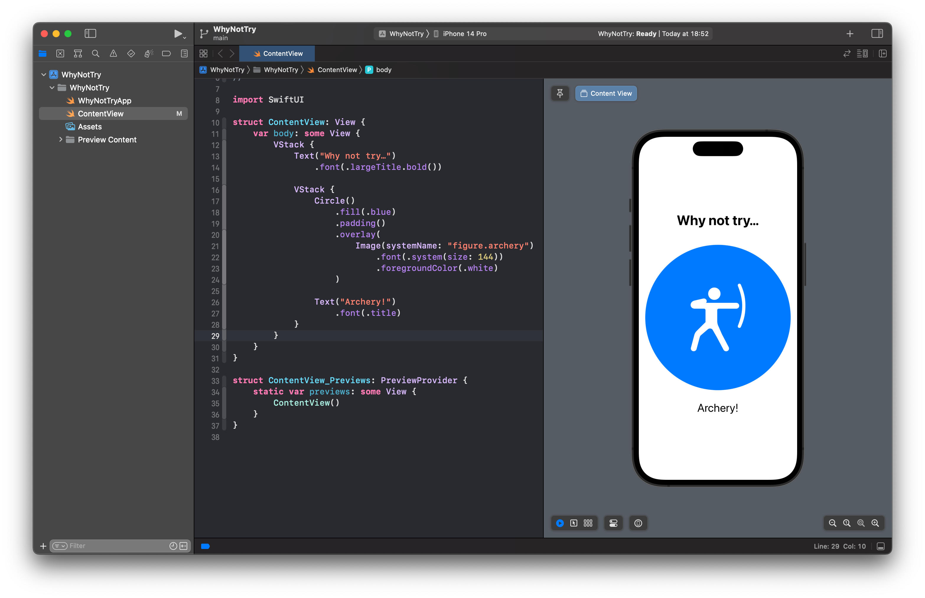
Now we have two VStack views: an inner one that holds the circle and “Archery!” text, and an outer one that adds a title around the inner VStack. This will be very helpful later on when we add animation!
Bringing it to life
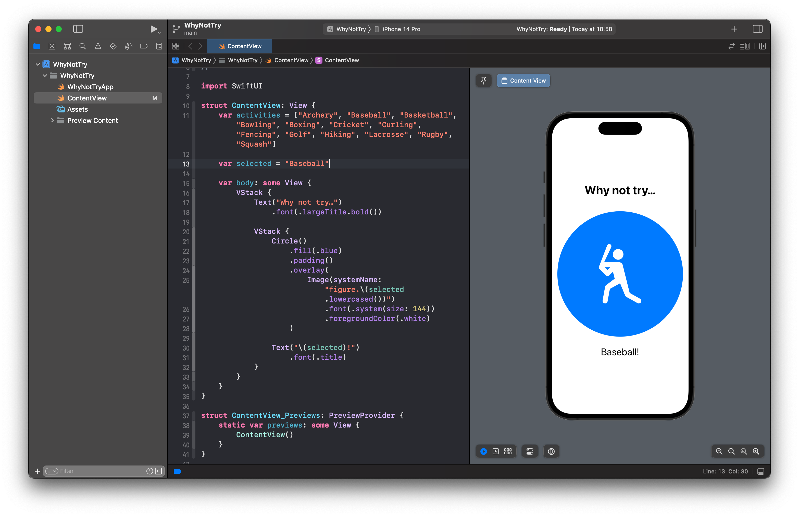
As much fun as archery is, this app really needs to suggest a random activity to users rather than always showing the same thing. That means adding two new properties to our view: one to store the array of possible activities, and one to show whichever one is currently being recommended.
SF Symbols has lots of interesting activities to choose from, so I’ve picked out a handful that work well here. Our ContentView struct already has a body property containing our SwiftUI code, but we want to add new properties outside that. So, change your code to this:
struct ContentView: View {
    var activities = ["Archery", "Baseball", "Basketball", "Bowling", "Boxing", "Cricket", "Curling", "Fencing", "Golf", "Hiking", "Lacrosse", "Rugby", "Squash"]

    var selected = "Archery"

    var body: some View {
        // ...
    }
}
Important: Notice how the activities and selected properties are inside the struct – that means they belong to ContentView, rather than just being free-floating variables in our program.
That creates an array of various activity names, and selects archery as the default. Now we can use the selected activity in our UI using string interpolation – we can place the selected variable directly inside strings.
For the activity name this is straightforward:
Text("\(selected)!")
    .font(.title)
For the image this is a little more complicated, because we need to prefix it with figure. then lowercase the activity name – we want figure.archery rather than figure.Archery, otherwise the SF Symbol won’t be loaded.
So, change your Image code this:
Image(systemName: "figure.\(selected.lowercased())")
Those changes mean our UI will display whatever the selected property is set to, so can see it all change if you place a new string in that property:
var selected = "Baseball"
Of course, we want that to change dynamically rather than having to edit the code each time, so we’re going to add a button below our inner VStack that will change the selected activity every time it’s pressed. This is still inside the outer VStack, though, which means it will be arranged below the title and activity icon.
Add this code now:
Button("Try again") {
    // change activity
}
.buttonStyle(.borderedProminent)
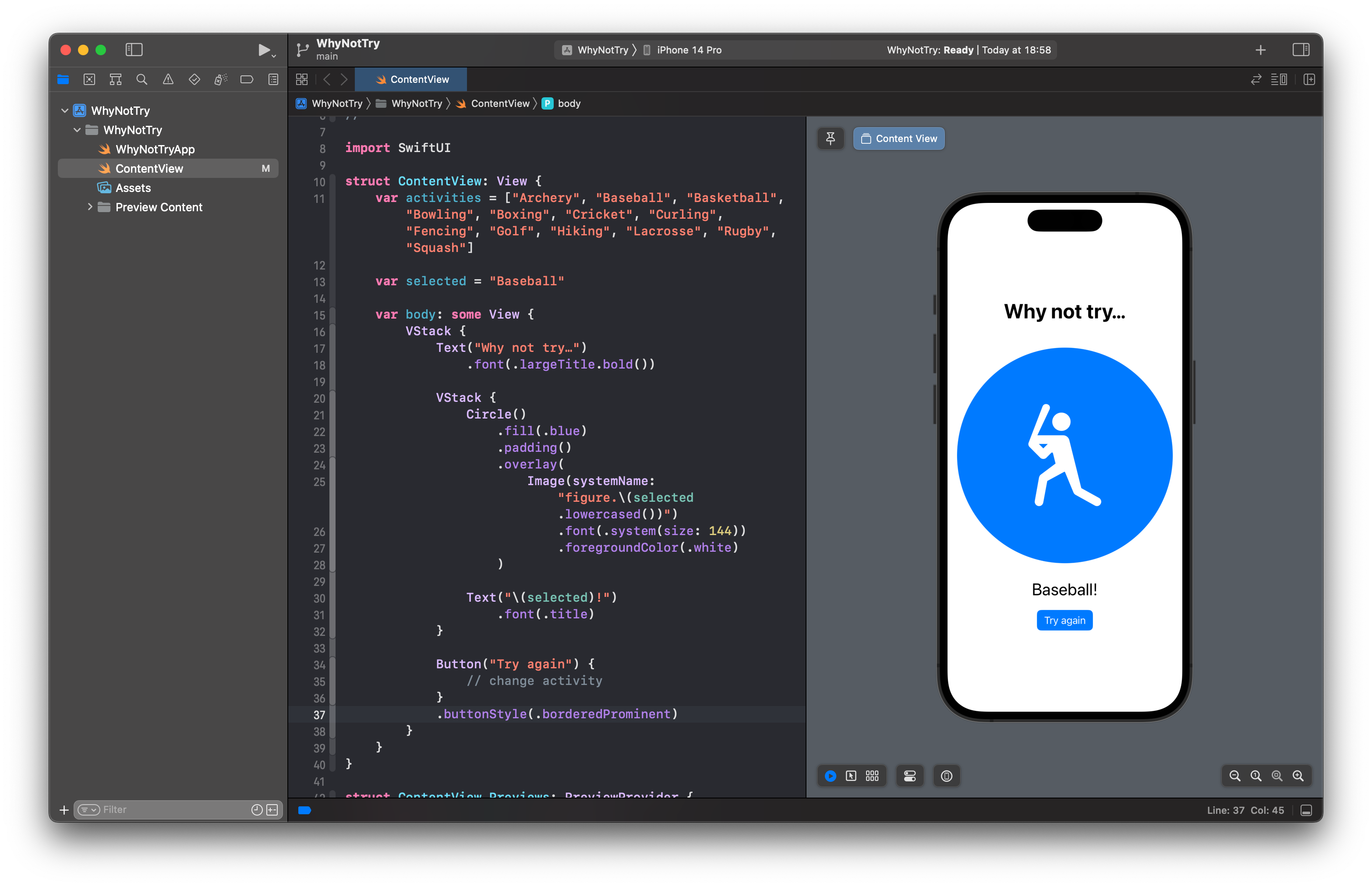
So, your structure should be this:
VStack {
    // "Why not try…" text

    // Inner VStack with icon and activity name

    // New button code
}
The new button code does three things:
- We create the
Buttonby passing in a title to show as the button’s label. - The
// change activitycomment is code that will be run when the button is pressed. - The
buttonStyle()modifier tells SwiftUI we want this button to stand out, so you’ll see it appear in a blue rectangle with white text.
Just having a comment as the button’s action isn’t very interesting – really we want to make it set selected to a random element from the activities array. We can pick a random element from the array by calling the helpfully named randomElement() method on it, so replace the comment with this:
selected = activities.randomElement()
That code looks right, but it will actually cause compiler errors. We’re telling Swift to pick a random element from the array and place it into the selected property, but there’s no way for Swift to be sure there’s anything in that array – it could be empty, in which case there’s no random element to return.

Swift calls these optionals: randomElement() won’t return a regular string, it will return an optional string. This means the string might not be there, so it’s not safe to assign to the selected property.
Even though we know the array will never be empty – it will always have activities in there – we can give Swift a sensible default value to use just in case the array happens to be empty in the future, like this:
selected = activities.randomElement() ?? "Archery"
That partly fixes our code, but Xcode will still be showing an error. The problem now is that SwiftUI doesn’t like us changing our program’s state right inside our view structs without warning – it wants us to mark all the mutable state ahead of time, so it knows to watch for changes.
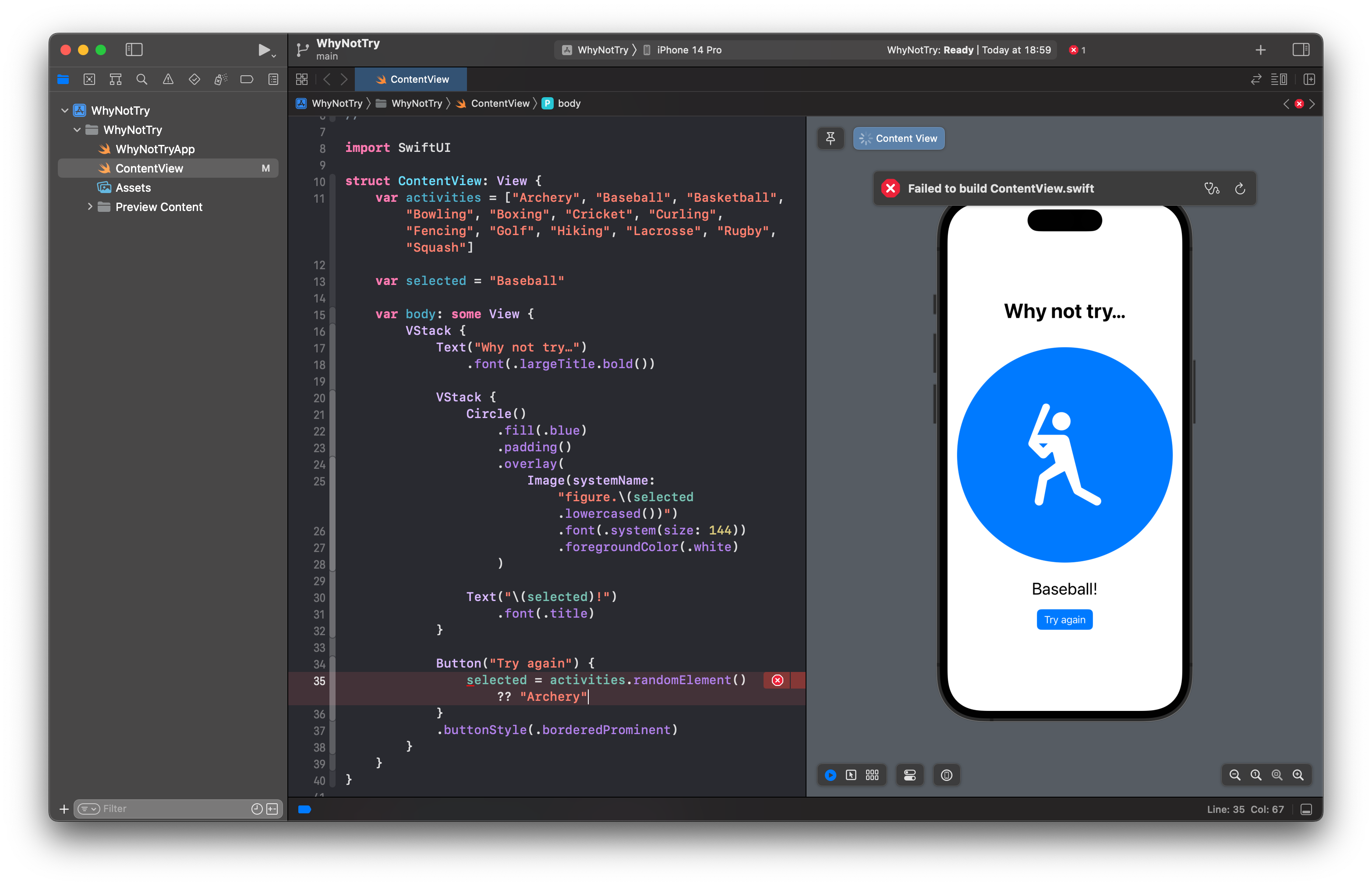
This is done by writing @State before any view properties that will change, like this:
@State var selected = "Baseball"
This is called a property wrapper, meaning that it wraps our selected property with some extra logic. The @State property wrapper allows us to change view state freely, but it also automatically watches its property for changes so that it can make sure the user interface stays up to date with the latest values.
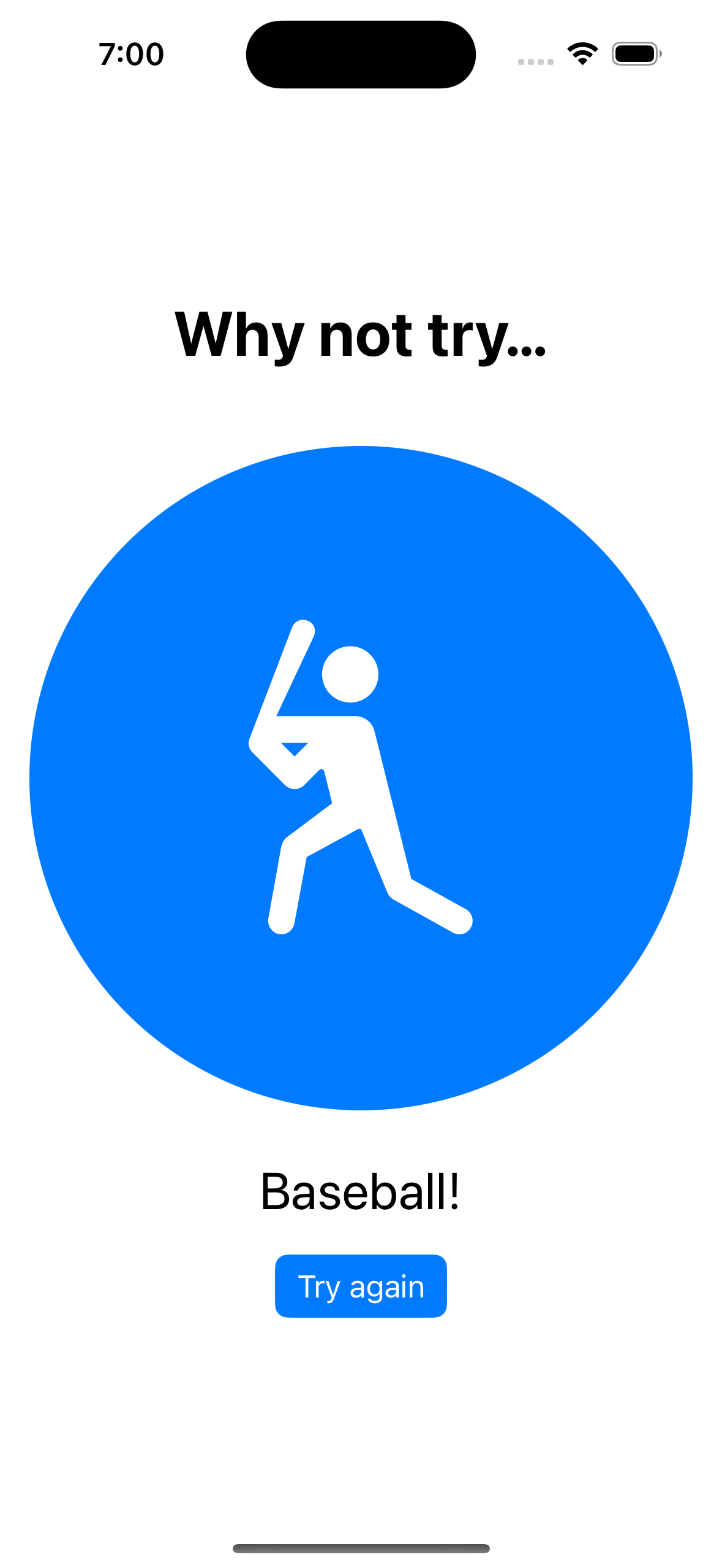
That fixes the two errors in our code, so you can now press Cmd+R to build and run your app in the iOS simulator. It will suggest baseball by default, but every time you press “Try again” you’ll see it change.
Adding some polish
Before we’re done with this project, let’s add a handful more tweaks to make it better.
First, an easy one: Apple recommends that local view state always be marked with private access control. In larger projects, this means you can’t accidentally write code that reads one view’s local state from another, which helps keep your code easier to understand.
This means modifying the selected property like so:
@State private var selected = "Baseball"
Second, rather than always showing a blue background, we can pick a random color each time. This takes two steps, starting with a new property of all the colors we want to select from – put this next to the activities property:
var colors: [Color] = [.blue, .cyan, .gray, .green, .indigo, .mint, .orange, .pink, .purple, .red]
Now we can change our circle’s fill() modifier to use randomElement() on that array, or .blue if somehow the array ends up being empty:
Circle()
    .fill(colors.randomElement() ?? .blue)
Third, we can separate the activity VStack and “Try again” button by adding a new SwiftUI view between them, called Spacer. This is a flexible space that automatically expands, which means it will push our activity icon to the top of the screen, and the button to the bottom.
Insert it between the two, like this:
VStack {
    // current Circle/Text code
}

Spacer()

Button("Try again") {
    // ...
}
If you add multiple spacers, they will divide the space equally between them. If you try placing a second spacer before the “Why not try…” text you’ll see what I mean – SwiftUI will create and equal amount of space above the text and below the activity name.

And fourth, it would be nice if the change between activities was smoother, which we can do by animating the change. In SwiftUI, this is done by wrapping changes we want to animate with a call to the withAnimation() function, like this:
Button("Try again") {
    withAnimation {
        selected = activities.randomElement() ?? "Archery"
    }
}
.buttonStyle(.borderedProminent)
That will cause our button press to move between activities with a gentle fade. If you want, you can customize that animation by passing the animation you want to the withAnimation() call, like this:
withAnimation(.easeInOut(duration: 1)) {
    // ...
}
That’s an improvement, but we can do better!
The fade happens because SwiftUI sees the background color, icon, and text changing, so it removes the old views and replaces it with new views. Earlier I made you create an inner VStack to house those three views, and now you can see why: we’re going to tell SwiftUI that these views can be identified as a single group, and that the group’s identifier can change over time.
To make that happen, we need to start by defining some more program state inside our view. This will be the identifier for our inner VStack, and because it will change as our program runs we’ll use @State. Add this property next to selected:
@State private var id = 1
Tip: That’s more local view state, so it’s good practice to mark it with private.
Next, we can tell SwiftUI to change that identifier every time our button is pressed, like this:
Button("Try again") {
    withAnimation(.easeInOut(duration: 1)) {
        selected = activities.randomElement() ?? "Archery"
        id += 1
    }
}
.buttonStyle(.borderedProminent)
Finally, we can use SwiftUI’s id() modifier to attach that identifier to the whole inner VStack, meaning that when the identifier changes SwiftUI should consider the whole VStack as new. This will make it animate the old VStack being removed and a new VStack being added, rather than just the individual views inside it. Even better, we can control how that add and remove transition happens using a transition() modifier, which has various built-in transitions we can use.
So, add these two modifiers to the inner VStack, telling SwiftUI to identify the whole group using our id property, and animate its add and removal transitions with a slide:
.transition(.slide)
.id(id)
Press Cmd+R to run your app one last time, and you should see that pressing “Try Again” now smoothly animates the old activity off the screen, and replaces it with a new one. It even overlaps animations if you press “Try Again” repeatedly!
Where now?
We’ve covered a lot of SwiftUI basics in this tutorial, including text, images, buttons, stacks, animation, and even using @State to mark values that change over time. SwiftUI is capable of so much more, and can be used to build complex cross-platform apps if needed.
If you’d like to continue learning SwiftUI, there are lots of free resources available. For example, Apple publishes a wide variety of tutorials covering essential topics, drawing and animation, app design, and more. We’ll also post links here on Swift.org to some other popular tutorials – we’re a big and welcoming community, and we’re glad to have you join!
The source code for this guide can be found on GitHub